WeHike
Hiking app
weHike is a conceptual mobile app designed to assist hikers in planning upcoming trips and navigating novel trails curated by other users. The app aims to foster a community-driven environment with user-to-user created content.
Originally developed as an educational project in 2019 to gain hands-on experience in app design, I found the concept of weHike to be genuinely interesting. Consequently, I was motivated to redesign the app utilizing my improved skills and knowledge since then. The primary objective of the redesign was to further enhance my proficiency in User Interface (UI) design, with a specific emphasis on implementing and optimizing graphical user interfaces (GUI).

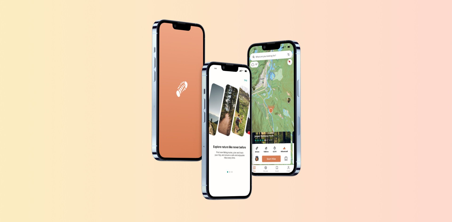
Press "App Demo" to see a temporary presentation of the weHike app in Figma. Click around the app see the features
NOTE: weHike is unfinished and therefore new features will be added on an ongoing basis
WeHike
My projects / WeHike
Revisiting the old design
Looking back, I aim to preserve the core functionality of the app, which revolves around enabling users to record their own routes using the app. During their hike, the app tracks their progress. Upon completing the hike, they have the option to assess its difficulty, attach relevant tags, upload pictures, and subsequently publish it for other users to explore. Additionally, the app automatically incorporates the duration and length of the route. Once published, the route is displayed on the map as a waypoint, enabling other users to tap on it and access detailed route information.
In the original design, the user's profile picture was positioned in the lower-left corner of the app, intending to create a more immersive experience. However, I believe it would be more effective to incorporate a recognizable navigation bar at the bottom, aligning with Jakob's Law for enhanced usability and familiarity.
Customize your journey
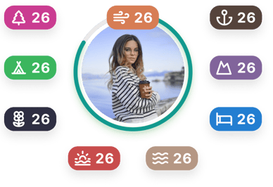
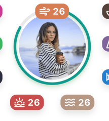
Creating a community-powered hiking app entails enabling individuals to personalize their profile pages. As a result, WeHike grants users the ability to customize their leveling badge, by selecting colors that align with their personal style and choosing icons from a thoughtfully curated collection to help express their unique journey
Year: 2023 - Currently Ongoing
Trailblazing animation welcomes the user to the app
The purpose of the animation is to introduce a visually pleasing element to the app, aiding in enhancing the app's storytelling. Additionally, I experimented with creating animations within Figma.
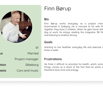
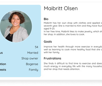
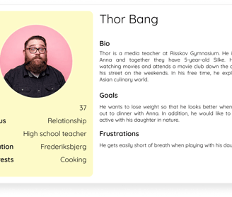
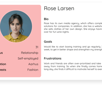
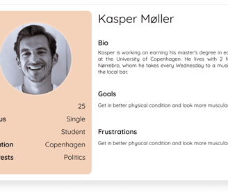
Creating personas
To make our user group audience easier to understand and empathize with we developed several personas based on our research with their major goals and frustrations to sketch out different types of users in our user group.


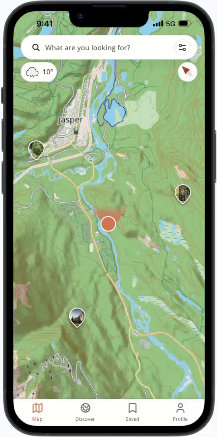
Selecting routes on the map
While navigating the map, users can select a waypoint pin to view a user-created hiking route. Upon selecting a waypoint pin, a user-friendly UI card opens, providing relevant information concerning the route. This includes details such as total distance, maximum elevation, average completion time by other users, and the difficulty level established by the route's original creator.
By swiping the card upward, the UI card expands to unveil more in-depth information about the hiking route, including images, weather forecasts, reviews, tags, and a detailed description. Should users decide to embark on the route after reviewing this information, they can simply click the "Start Hike" button. Alternatively, they have the option to click the bookmark icon at the top to save the route for future reference
Creating a solution
Inspiration Cards Workshop (modified)
After identifying a user group we entered the idea phase and in order to brainstorm ideas and narrow down potential future designs, we decided to do a modified version of the “Inspiration Cards Workshop” within our group.
In this workshop, we placed a lot of pre-written labels with words describing technologies and domain cards, which is relating to our specific project. We first collectively went through the labels to ensure a shared understanding of their meaning. Next, we combined 3 cards we found interesting and presented them for each other.
The workshop helped to expand our area of thought and it made us see combinations of things we did not consider beforehand.
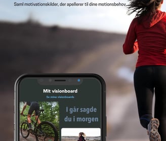
The concept: Through this, we came up with the concept to develop a digital vision board in the form of an app designed to help people keep up and increase ones motivation to exercise. One fundamental idea of our initial concept was to automatically change the user’s background every hour to a random picture acquired from the user's own motivational vision board. Hereby, the user will be unexpectedly reminded of their sources of motivation, which they themselves place on their vision board in the Mova app, which should help support their inner motivation to exercise.
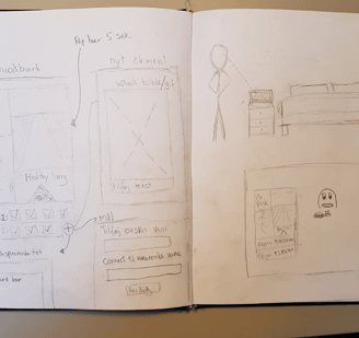
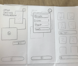
Initial ideation
The early ideation phase involved sketching out wireframes, different ideas, and low-fidelity mockups of functionality and the look of the app. Below is a selection of some of our raw concepts:


Prototyping the app
To bring our idea to life we designed an interactive prototype of our concept in Adobe Xd, which includes the following:

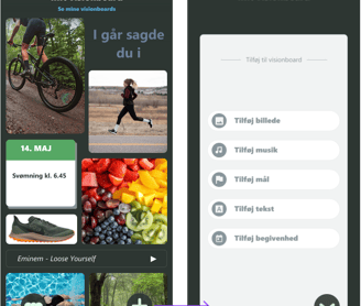
My vision board is the main page of the app. On this page, the user can see the elements he/she has chosen.

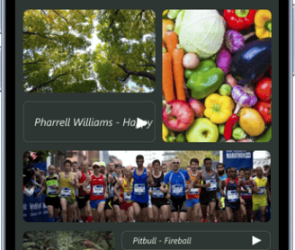
← In the 'Udforsk' (discover) tab users can search for and add media within pre-determined categories of interest but also through the search bar.

Presenting for stakeholders
Concept video
Flyer design
To brand the app, we came up with a flyer design that introduces a potential user to the app.


->
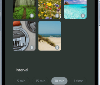
For each visionboard the users can edit and set their background to change to randomly selected pictures from your visionboard every 5, 10, or more minutes to act as motivational triggers.
App icon
For the presentation, we produced a concept video visualizing how the app would be used by the users.
For simplicity, we opted for a lowercase “m” in the top right corner of the app icon with a focus on the dimensions of the iOS platform. The Mova green with 2 different underlying greens should give depth and represent a board with several elements.
Logo
We wanted to distinguish the logo more from other brands for the in-app logo. Without the restrictive dimensions of the IOS platform, we wanted the app to symbolize the moodboard concept more. Here we make the green squares break out and lay on top of each with the whole mova word written out.
Post-project review
My thoughts
Even though Alm. Brand liked our concept design, they didn't choose to pursue our concept further, I learned many things in the process about app development for a company as a customer. If the project had been selected to work on further, I would have focused on getting the app into the hands of users, so that we could improve the app with the help of user feedback.
Moreover, I would have taken Alm. Brand's feedback and gone back a step in the process to develop an app according to their needs.
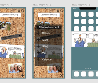
On the pop-up window, you can choose between different media, which you want to add to your visionboard. Users are encouraged to add media that can help motivate them through pictures or music. A goal could be to run 3 times a week. An event could be that you have Volleyball practice at 18 on Tuesdays.
Press the " + " to add more elements to the board.
Old app design
As highlighted in the introduction, the purpose of the old design was to gain practical experience in app design as a part of my bachelor's degree, resulting in a presentation and a report within a week's timeframe. However, due to the time constraint, our progress with the app was somewhat limited. As a part of the redesign process, I needed to reevaluate the original design and see what I could use and couldn't.
New app design
Guiding users into the app experience
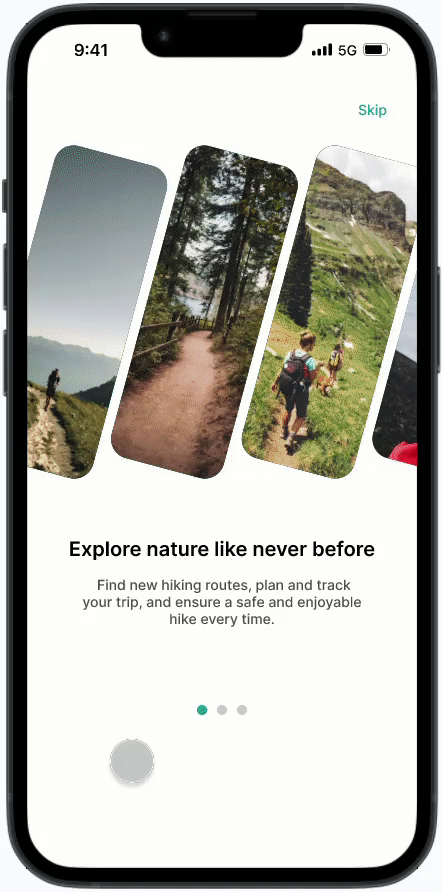
The initial moments a user spends within an app are crucial. Therefore, it is essential to craft an onboarding sequence that captivates users right from the beginning of the adoption phase.
I focused on the simplicity of a carousel to avoid overwhelming the users, allowing them to swipe through at their own pace. The images are meant to foster a sense of connection and intrigue towards the essence of hiking. They visualize the stories and memories users are about to create when using the app.
Follow your favorite hikers
WeHike embraces interaction, knowledge sharing, and support among hikers. Users can follow their favorite outdoor enthusiasts and gain inspiration to explore new hiking routes from around the world.
Upon viewing a profile page, you can observe their interactions within the community, whether they involve comments or reviews on hikes. You can also explore the hikes a specific user has created and choose to follow them.
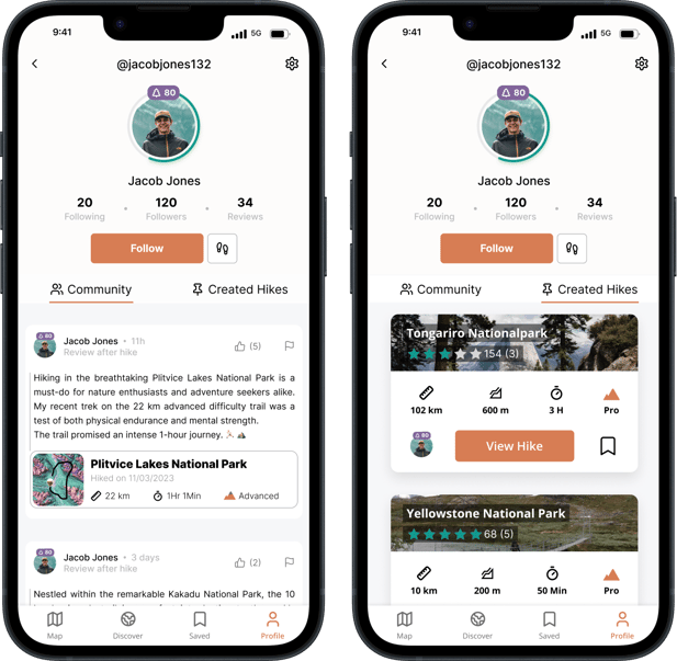
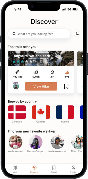
Discover nature's hidden gems
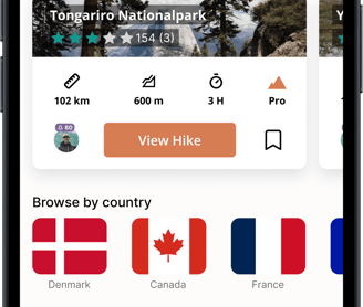
Through the Discover page, users can utilize the search bar and customizable filters to find the perfect trail that matches their specific preferences. They can discover the best trails in their neighborhood with a list of the top hiking routes nearby.
Furthermore, users can explore trails across countries and continents through the feature that allows them to search by specific countries.
With weHike, users can easily find and follow other hiking enthusiasts, making it simpler than ever to discover new routes, exchange tips, and forge lasting connections with like-minded weHikers
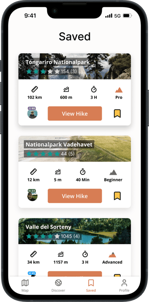
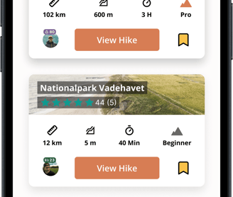
Saved for later
Saved adventures are neatly stored and ready to be rediscovered on the Saved page.
Users can save hikes by clicking on the bookmark icon, and then the hike is saved to the 'Saved' subcategory in the navigation bar.