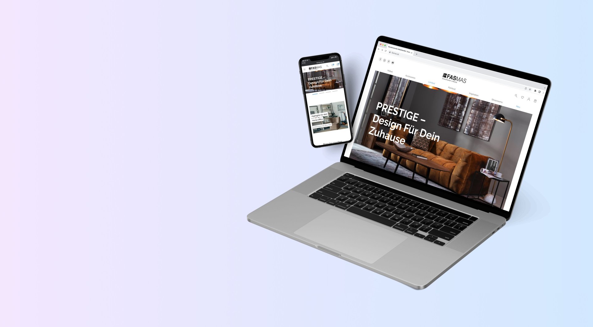
Fasmas.de
Responsive Website Design
The furniture and lifestyle chain Fasmas approached my workplace to create a new online presence, encompassing both front-end and back-end development. I was assigned as the lead designer for the front-end aspect of the project, and my responsibilities included:
Redesigning their website within their existing brand identity.
Designing three new functionalities for their website.
Initially, I conducted a stakeholder meeting with Fasmas during which we thoroughly discussed the project goals and design preferences.


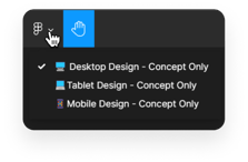
Press "View Design" to see an overview of the desktop, tablet, and mobile versions of the design in a Figma workspace. Drag around the different frames and click on the left to change the screen size.
Fasmas.de
My projects / Fasmas.de
The stakeholder meeting
We agreed that the new website should include the same visual identity but fit a more modern e-commerce standard and include a unique spin on the shopping experience. The new design had to include everything from the front page, account pages, 404 pages, and career page for all 3 devices; mobile, tablet, and PC.
Below, I will present the three new design elements we decided to develop.
3 key new design elements that need to be done:
1. Configurator
One of the requirements of the new website was to better visualize which products could be added to an item. This was aimed at facilitating cross-selling and providing improved customer assistance during their purchase journey. To cater to Fasmas' product range, we developed 2 distinct configurator designs for their website. One design was dedicated to regular items, such as their configurable modular sofa series 'Palermo,' while the other was tailored specifically for their children's bed series, "Moby."
Year: 2022 • Copyright Codeful ApS
Note: This design concept was initially created as a proposed responsive website design. However, during the development process, the client decided to pursue a different direction. As a result, this showcase represents ONLY the original design concept and does not reflect the current design featured on their website.
2. Order Fabrics
Fasmas boasts an extensive assortment of fabric colors and textures, presenting a challenge when it comes to decision-making within a digital environment. In their current setup, Fasmas already have the possibility for customers to order the fabric, however, it is currently located alongside each product. To address this issue, we made the strategic decision to create a dedicated reference page that provides customers with a comprehensive overview of the fabric collection.
Purchasing furniture online poses a unique challenge due to the absence of physicality and the inability to experience the tangible properties of fabrics and measurements firsthand. This often leads to confusion among consumers and, consequently, a lower conversion rate if proactive measures are not taken. Moreover, the inherent variability in color settings across different monitors and mobile devices further exacerbates this issue. Thus, offering the option to order fabric swatches for customers to view within their intended context is an indispensable component of delivering exceptional customer service and ensuring a positive customer experience.
3. Blog
For the revamp of their blog section, our objective was to create a visually captivating and contemporary design. The existing blog layout appeared rather simplistic and outdated, failing to entice new customers to delve deeper into the brand and its offerings. To address this, we implemented a distinct website structure to enhance the immersive and interactive nature of the blog section.
The revamped blog now features an infinite scroll functionality, accompanied by a static navigation bar positioned on the top left side. This navigation bar includes the publication year of each blog post, providing customers with a clear understanding of the recency of the content. As users scroll through the page, the navigation bar remains fixed, ensuring ease of access. Additionally, when accessing an individual blog post, the browsing experience flows seamlessly to the subsequent articles.
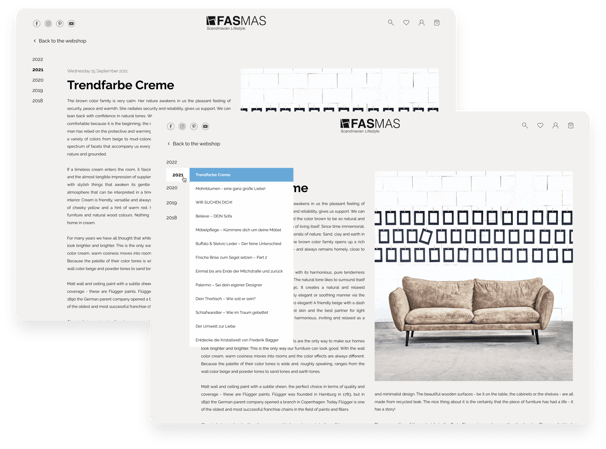

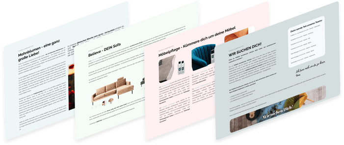
To augment the visual distinction between blog posts, we incorporated a progressive transition of pastel background colors. This deliberate choice allows readers to readily discern when they have transitioned to a new article, enhancing readability and engagement.
Visualized on the left are some blog examples I made.
Before and after slider:



(The animation uses placeholder images to visualize the concept)
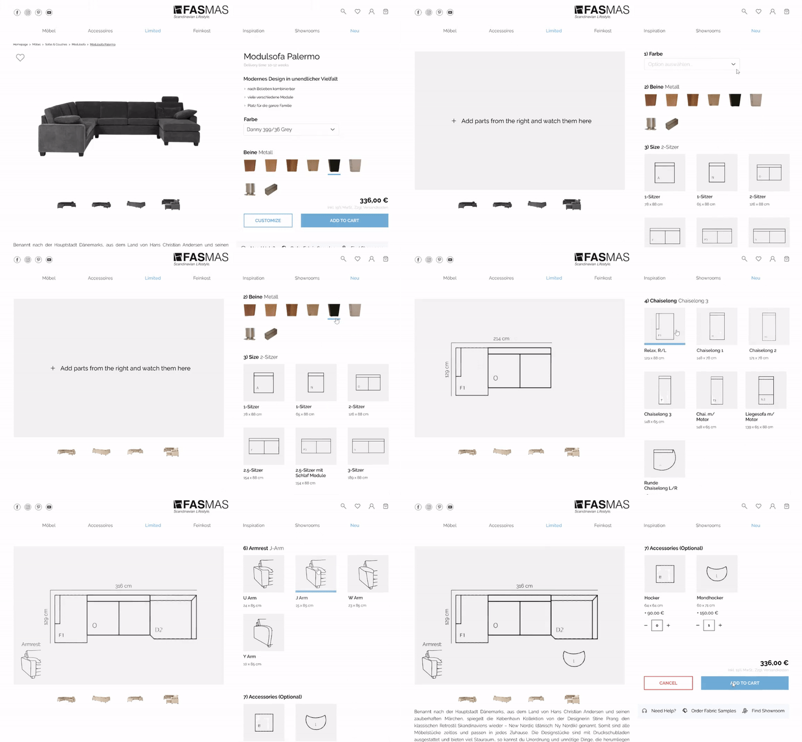
As there are limited customization possibilities for products like sofas and chairs compared to their children's beds, I decided to make the customizer an integrated part of the product page to make it intuitive and straightforward for the customer.
As the customer begins the customization they will be guided through the process with auto-scrolling. And at the end, they ‘Cancel’ their customization by clicking on the button at the button.
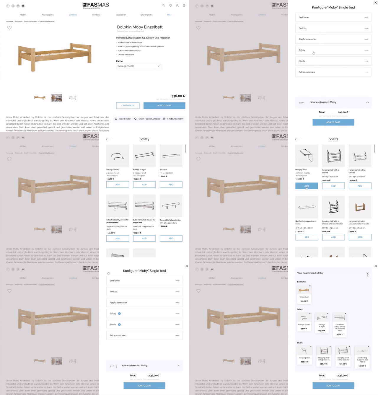
Due to the large selection of accessories for their children's beds, I chose to make a separate slide-in widget as the configurator. This would make it easier for the customer to keep an overview of all the products and the different categories e.g. If they want to add more ‘Safety’ features to the bed or upgrade a single ‘Bedframe’ to a bunk bed.
With this, products are visualized as small cards they could add to customize their order and afterwards add to their shopping cart

(The animation uses placeholder images to visualize the concept)
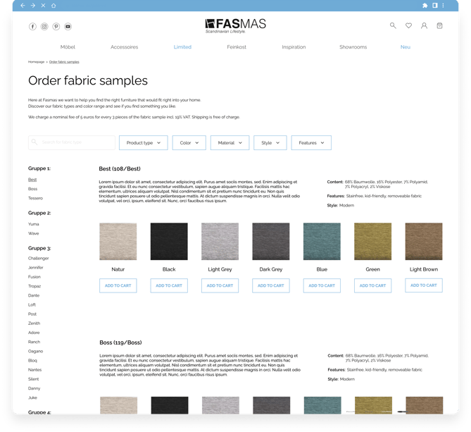
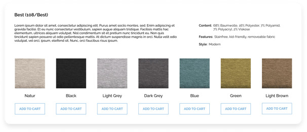
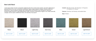
Each fabric has its name displayed with a short description associated with it. The properties of the specific fabric can be viewed next to the description on the right side. Below the information, the customer can view which colorways that are possible for that specific fabric.
In addition, a button has been added to each color for a specific fabric sample, so customers can easily mix and match different ones until they've found the perfect combination!
It is also on this page that customers should refer to in order to see a larger picture of the texture and color of the fabric, before possibly ordering fabric samples for their own homes.
